
Andrew Lefurge
Empowerment: A, G, M
Concept & Research
It can be hard to be yourself. It is even harder when you feel like being yourself means being “different” or “weird” and that in doing so you are making yourself a target of unwanted attention. This is a daily struggle for many of us but especially for students in middle school who are still discovering who they are in an environment filled with tremendous pressure and expectations.
To empower young students to be confident in their identities we researched the types of imagery and language that have led to problematic notions of “normality” and explored ways to subvert them in our work. This led to us focusing primarily on the use of metaphor and abstraction both visually and in our language to separate our work from the preexisting expectations students have about the subject.
A is for Access
With the opportunity to design the first spread of the book, I wanted to present a simple and positive message that could set the tone for the rest of the book. The main challenge I faced when designing for Access was portraying Accessibility as more than just a “charity” or “kindness”.
I wanted to show that having different types or degrees of access was natural and expected and that your access being different from someone else’s doesn’t change your capacity to engage in the same emotionally fulfilling relationships and experiences as someone else. This is why I opted to use anthropomorphized creatures instead of humans, as there is no expectation for what their “normal” abilities are.

G is for Gender
Gender and Sex are incredibly complex and nuanced topics that can carry a lot of weight and meaning when it comes to personal identity. Doing this subject justice what an incredibly intimidating challenge as I didn’t want anyone to feel misrepresented or marginalized by my representation of the subject.
After research and deliberation, I decided that the most positive and helpful approach I could take was to focus on dispelling gender norms rather than trying to explain the complexities of sex and gender to a young audience. With this in mind, my goal was to create an illustration that conveys the message, that you can always be the hero of your story.

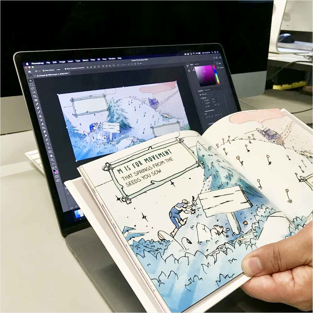
M is for Movement
For the Movement Spread, I really wanted to capture the slow passage of time. Every important movement begins as a small seed of an idea that when properly nurtured grows and spreads. To illustrate this I tried to use the two pages I had in the spread to show the same environment at two points in time without showing the same thing twice.
The metaphors I am using for Movement are also extended into the interact element of the page, which allows the user to color the environment in how they want. This emphasizes how every movement comes from a personal place and how they choose to color the page is a reflection of what is important to them in the movements they choose to be a part of.

Reflection
This project turned out to be one long exercise in stripping away excess. At every step during the design process, I had to look back at what I had so far and ask “do I need any of this?” The answer to that question most of the time was “no”, and figuring out what elements were vital and what could be scraped was a frustrating but ultimately rewarding design exercise. Going through this process not only benefited me as a designer but lead to final product that is clearer in its intent and use.
Downloadable Assets
You may use the below assets created for this project provided via Figma as long as you give attribution, share your outcomes, and if your use is non-commercial in nature.
